Tanya & Matt's Ice Creamiest
Logo Design for a Small Town Ice Cream Parlor
Logo
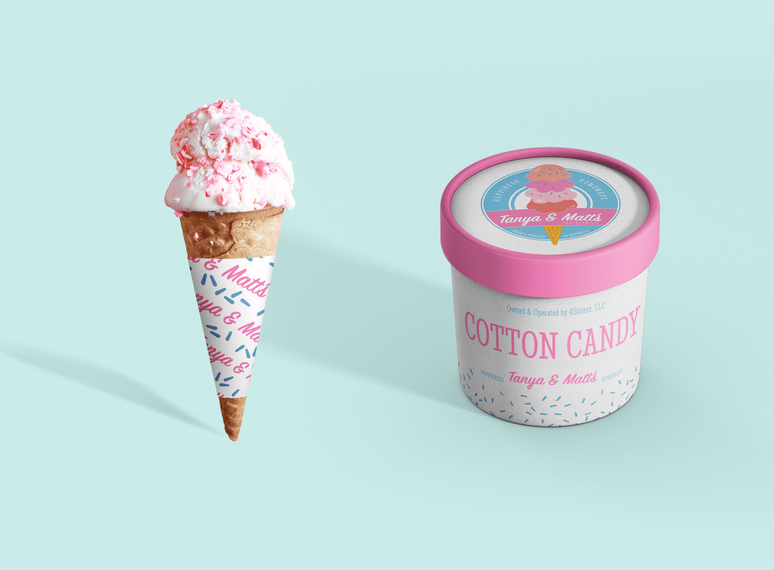
New owners of the ice cream parlor Tanya & Matt’s wanted a logo redesign for a younger and brighter look. Their goal was to use the logo and its graphic element across their branding for more use and flexibility.
Moodboard
The client was looking for a pink and blue color scheme for a saccharin, sweet tooth-inducing feeling. Bubblegum pink and a light baby blue were the color combos I pulled to start the conversation of color. I included a few images with cones to see how the main colors molded with the brown/yellow of the waffle cone that the client is know for making from scratch.
Process
Brainstorming was focused around the layout of the text and the emblem VS no background. Using the ampersand as the anchor for the logo helped tie in the rest of the copy the client requited.

Revision one solidified the two main colors of pink and blue into deeper tones. Second, a graphic element of the cone was added (created in Procreate) so we could minimize the ampersand. The client wanted the logo to scream ice cream shop.” Nothing says that better than an ice cream cone!

Revision two narrowed down exactly what verbiage was needed on the logo. The client was set on the blue emblem but wanted to play around with options for a banner across the front and how it would interact with the cone — possibly draping over the edge of the banner.
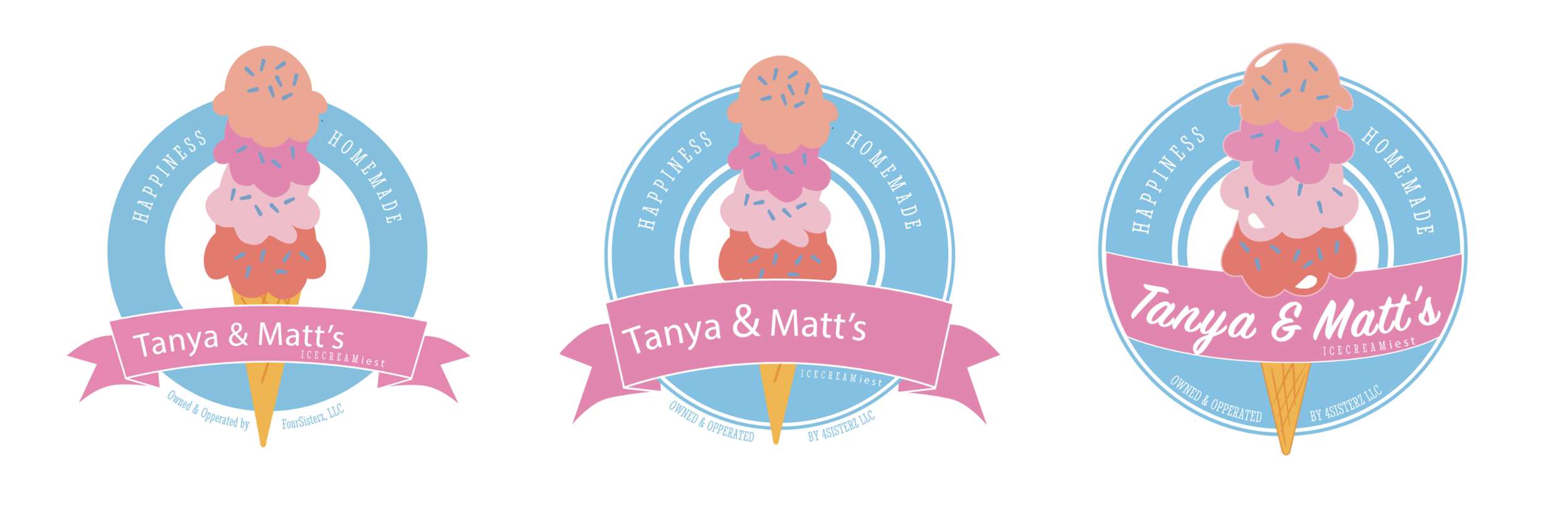
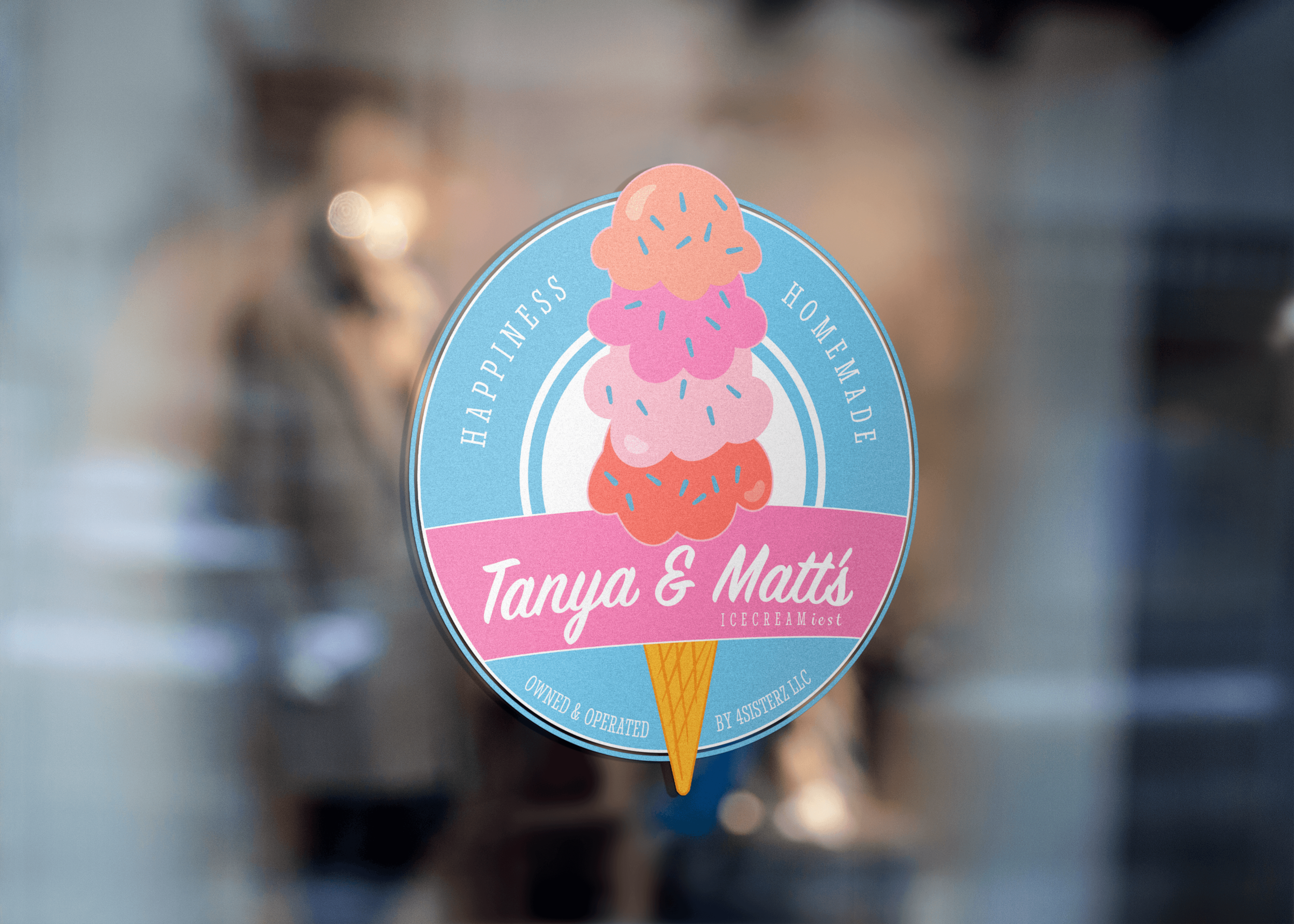
The third and final revision completed the styling of the emblem and the graphic element of the cone. I separated the two so that the client could use them as separate elements if needed on merchandise or branded items. Together they fill in the space within the emblem nicely. The pink edging around the cone still allows the cone to stand out and not “melt” into the blue and pink of the emblem background.


To see the company using the logo in their own branding check them out on their instagram at: https://www.instagram.com/tanyaandmattsicecream