Data Visualization
A Fun Promt Designed to test brand standards and clarity of information
Promt / Just For Fun
*The company whom this prompt was created asked that all logos and name references be removed for legal reason.
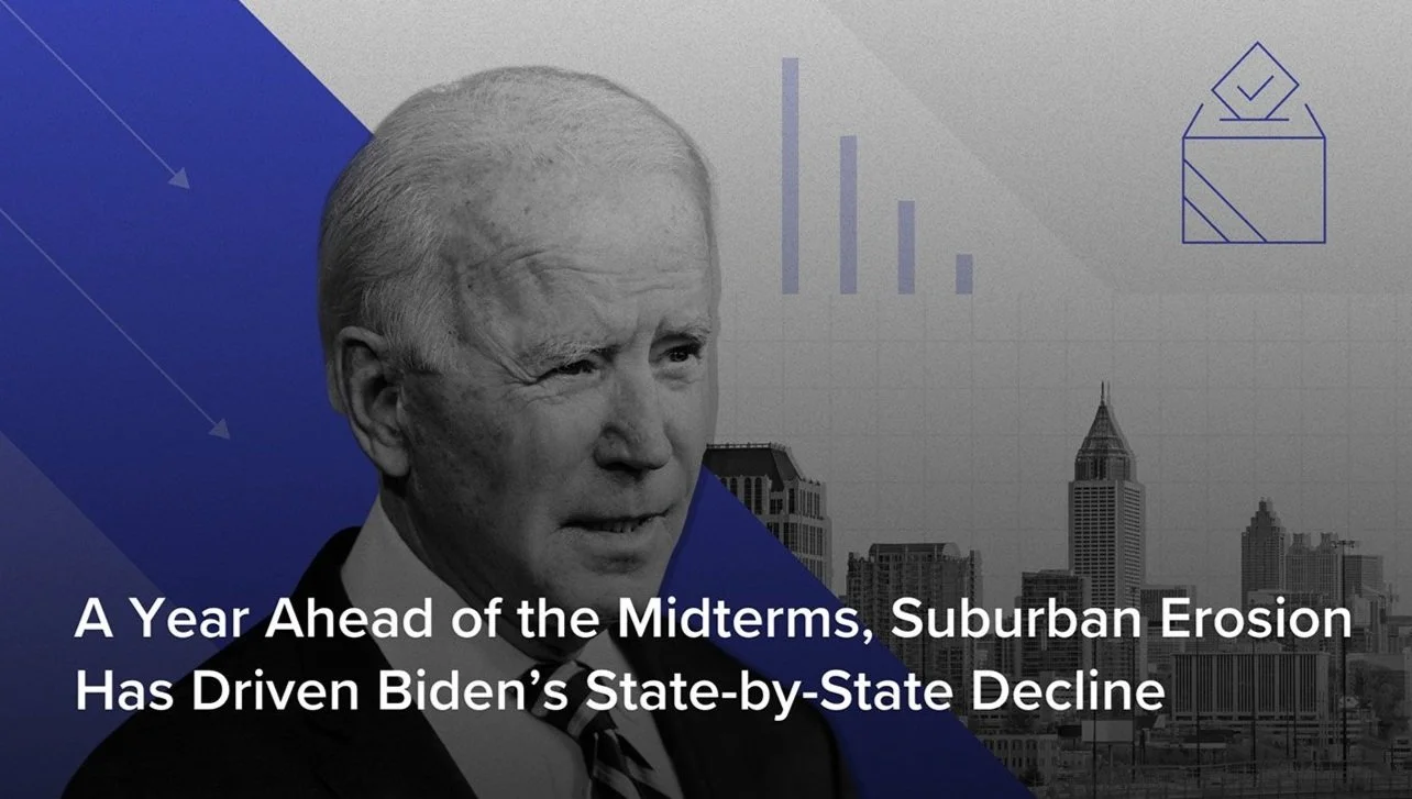
In a prompt to keep my skills sharp and to test out my ability of designing for data visualization, I used an existing global decision intelligence company that provides insights on existing market trends. They take real-time political, brand and geographical information that C-Suite and politically inclined organization would find relevant to business decisions and make it bite-size through visuals and need-to-know headlines.
Following their brand standards from font types, color, photography style and graphic elements, I designed a prompt that visually emphasized how the public is less and less lenient with modern TV hosts when they slip up- personally, politically or professionally.
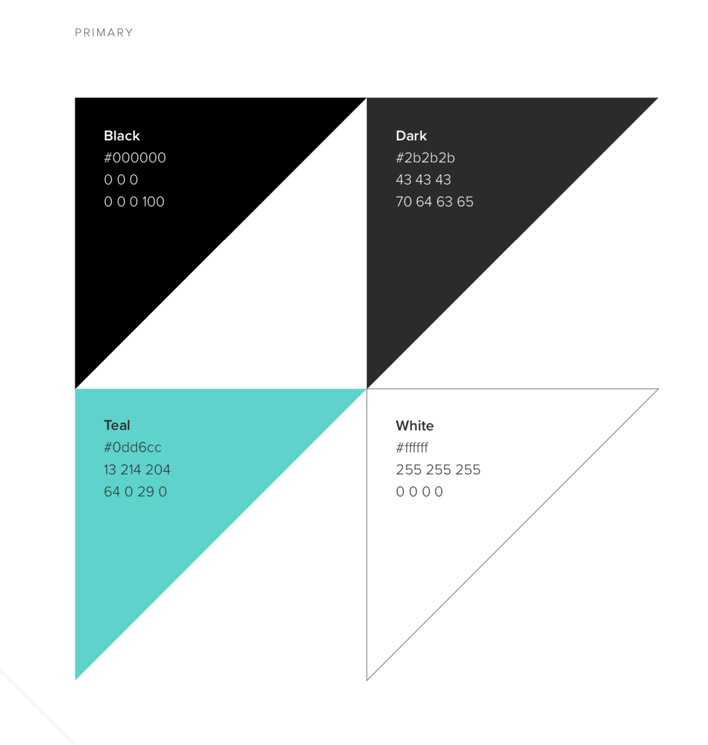
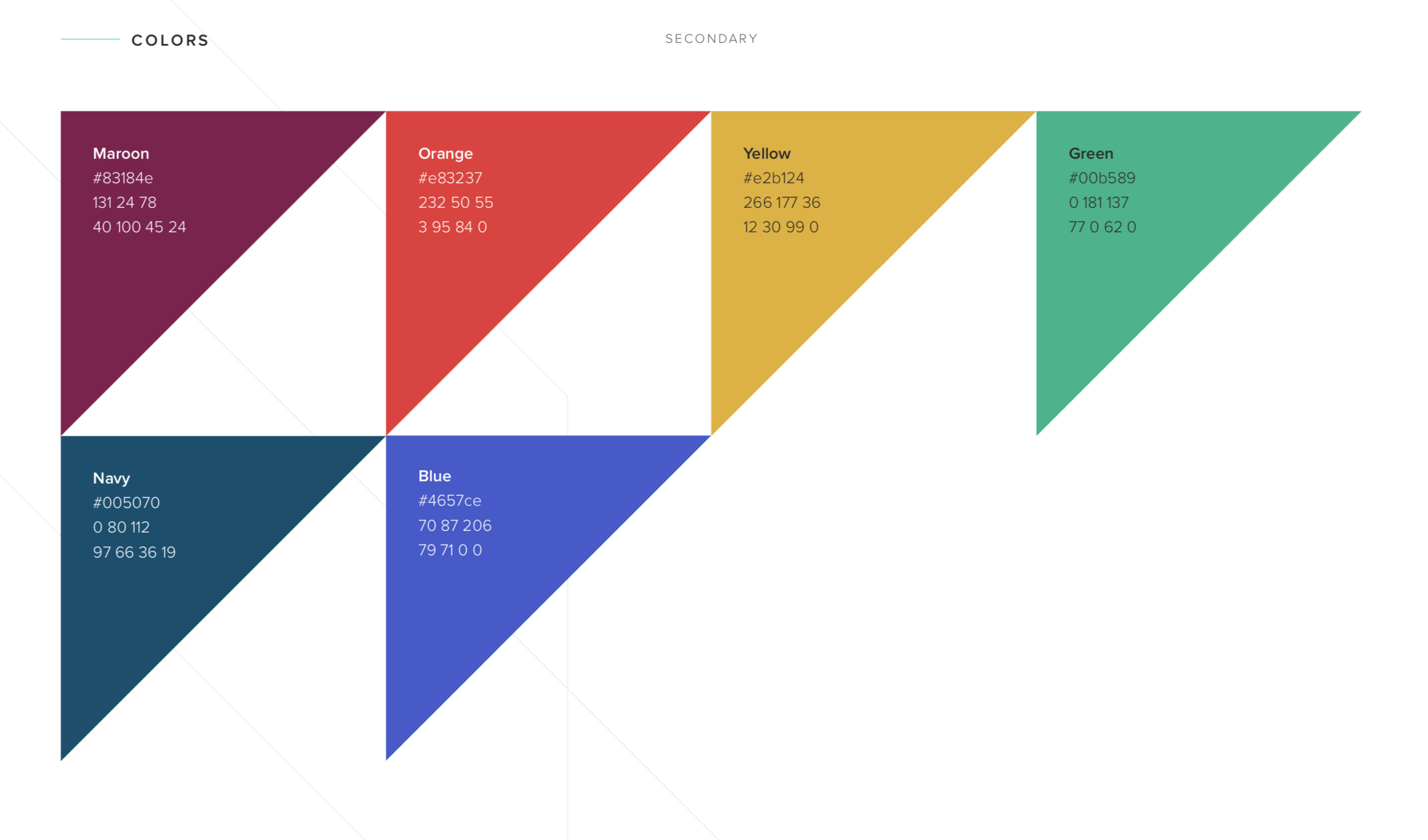
Primary and Secondary
Colors


